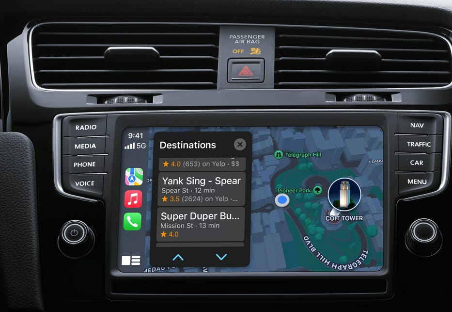
Process Analysis for Apple Map on CarPlay.
The Apple Map version in CarPlay has a different interface than the iPhone. In the iPhone Version, push a button on the keyboard and dictate your destination. Fortunately, system engineering helps us with process analysis. Here are the steps:
Push Button
Hear Prompt
Dictate Destination
In the CarPlay Version
Push Button.
Push Second Button (search button).
Listen to Full Sentence Prompt: “Where would you like to go?”
Wait for Beep Prompt
Dictate destination.
Listen to Response: “The closest one to you is Blah Blah. Would you like me to call or route there”?
Whatever you feel about those service robots using full grammar constructions and speaking full sentences, how wonderful that is for you. The iPhone that operates on a simple beep is proof that is significantly over communicating.
Over-communication takes up attention width of the driver. The driver has to be in control of his attention width. You are interrupting the Driver. Proponents of the Six Step Car Play version may argue some advantages of this system. I don’t see them.l. The fact is the iPhone process in my hand for all map searches is supierior and does not need improvement.
By trying to use this full-service robot with full grammar you've introduced interference into the cockpit of the car, so certainly the CarPlay version loses on the basis of being far more demanding of the drivers attention width. And it's getting worse. The prompt are getting longer.
Worst Part: there is no way to shut them off.
The Man Machine interface must strive for minimizing process steps, and minimizing new processes. This is an excellent example why it is a must to follow existing processes when porting to a new platform. Everyone using the CarPlay version already uses their iPhone. Apple claims that “CarPlay is a smarter, safer way to use your iPhone while you drive.”1 There is no evidence to support that, and plenty the opposite is true.
https://www.apple.com/ios/carplay/


